
Clip Path - Slanted Edges

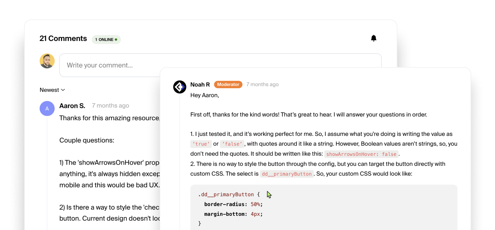
UI & UX
How to use:
Unlock more with PRO
Want to learn how to use this Crumb? Unlock detailed documentation, video tutorials, comments & support!
Upgrade to Pro
Unlock more with PRO
Want to learn how to use this Crumb? Unlock detailed documentation, video tutorials, comments & support!
Upgrade to Pro

Tutorial Coming Soon!
Check Browser Support
Interactive Table


Short Description:
Shape the edge of your sections, buttons or other elements to give them more character with some CSS using the clip-path property.
Want to contribute to the community?
Tell us what code you're working with. We would love to see it and possibly add it to the library.


