
Datepicker

Function
UI & UX
</ head>
<!-- DATE PICKER STYLES -->
<link rel="stylesheet" type="text/css" href="https://cdn.jsdelivr.net/npm/pikaday/css/pikaday.css">
<style>
:root {
	/* Color Settings */
  --accent-color: #7262e6;							/* Controls BG Color for Selected Date */
  --secondary-accent-color: #9287e2;		/* Controls Text Color for Current Date */
	--main-bg-color: #1f2023;							/* Controls BG Color of the Calendar */
  --secondary-bg-color: #27292d;				/* Controls BG for Calendar Dates */
  --heading-color: #ffffff;							/* Controls Main Heading Color */
  --font-color: #c1c9d2;								/* Controls Main Font Color */
  --accent-top-text-color: #ffffff;			/* Controls Font Color on top of Accent Color */
  --disabled-font-color: #999999;				/* Controls Disabled Font Color */
  --shadow-color: 0 5px 15px -5px rgba(0,0,0,.5);

  /* Size & Spacing Settings */
  --border-radius: 4px;									/* Controls Large Border Radius (Calendar Itself) */
  --border-radius-sm: 2px;							/* Controls Small Border Radius (Calendar Dates) */
  --font-size: 16px;										/* Controls Font Size */
  --table-gap: 2px;											/* High number is not recommended */

  /* Arrow Icons */
  --left-arrow: url('https://cdn.prod.website-files.com/5ef7d336e1f9137fc9a09781/5ef7dd958382e006f4eb2033_chevron-left.svg');
  --right-arrow: url('https://cdn.prod.website-files.com/5ef7d336e1f9137fc9a09781/5ef7dbca268421b03c01abf6_chevron-right.svg');
  --arrow-bg-color: transparent;
}


/* Picker Element Itself */
.pika-single {
  color: var(--heading-color);
  background: var(--main-bg-color);
  border: none !important;
  border-bottom-color: none !important;
  border-radius: var(--border-radius);
  font-family: inherit !important;
}

/* Datepicker Shadow */
.pika-single.is-bound {
  box-shadow: var(--shadow-color) !important;
}

/* Month & Year Displayed in Middle */
.pika-label {
  color: var(--heading-color);
  background-color: transparent !important;
}

.pika-prev, .is-rtl .pika-next {
	background-image: var(--left-arrow);
}
.pika-next, .is-rtl .pika-prev {
  background-image: var(--right-arrow);
}

/* This is the table element which includes the days labels and the days in the month */
.pika-table {
	border-spacing: var(--table-gap) !important;
  border-collapse: separate;
  font-size: var(--font-size) !important;
}

/* Days of the Week Labels */
.pika-table th {
  color: var(--font-color);
  text-align: center;
}

/* Days of the Week Underline - Example = underline dotted */
abbr[title] {
  text-decoration: none !important;
  cursor: default !important;
}

/* Month Days on Calendar - Default State */
.pika-button {
  color: var(--font-color);
  background: var(--secondary-bg-color);
  border-radius: var(--border-radius-sm);
  text-align: center;
  font-size: 12px !important;
}

/* Week Label */
.pika-week {
  color: var(--font-color);
}

/* Current Day Text/Number Color */
.is-today .pika-button {
  color: var(--secondary-accent-color) !important;
}

/* The Selected Date/Day */
.is-selected .pika-button {
  color: var(--accent-top-text-color) !Important;
  background: var(--accent-color);
  box-shadow: none !important;
}

/* Styles for any Disabled Dates/Days  */
.is-disabled .pika-button {
  color: var(--disabled-font-color);
  opacity: .3;
  background: transparent !important;
}

/* Styles for Date/Day Hover (can be same styles as "selected" styles) */
.pika-button:hover {
  color: var(--accent-top-text-color) !important;
  background: var(--accent-color) !important;
  border-radius: var(--border-radius-sm) !important;
}

/* Next & Prev Arrow Buttons */
.pika-prev, .pika-next {
	display: block;
	cursor: pointer;
	position: relative;
	outline: none;
	border: 0;
	padding: 0;
	width: 20px;
	height: 30px;
	text-indent: 20px;
	white-space: nowrap;
	overflow: hidden;
	background-color: var(--arrow-bg-color) !important;
	opacity: .5;
}
</style>
</ body>
<!-- DATE PICKER JS -->
<script src="https://cdn.jsdelivr.net/npm/pikaday/pikaday.js"></script>
<!-- FOR 'SINGLE' DATE PICKER ON ONE FORM/PAGE. REMOVE CODE BELOW IF NOT NEEDED! -->
<script>
var picker = new Pikaday({
	field: document.getElementById('datepicker'),
	disableWeekends: true, // Disables option to select weekend days
	firstDay: 0, // First day of the week - 0 for Sunday & 1 for Monday
	minDate: new Date(), // Disables option to select days prior to current day
  //yearRange: [1968, new Date().getFullYear().toString()], //Here you can choose the earliest year option to the current date or change "new Date().getFullYear().toString()" to 2008 for example.
});

//Sets Default Date to Current Date
picker.gotoToday()
</script>


<!-- FOR 'MULTIPLE' DATE PICKERS ON ONE FORM/PAGE. REMOVE CODE BELOW IF NOT NEEDED! -->
<script>
$('.date-picker').each(function() {  // ".date-picker" is the class name you would set on each field that needs a date picker.
    $(this).data('pikaday', new Pikaday({
      field: $(this)[0],
      disableWeekends: true, // Disables option to select weekend days
      firstDay: 0, // First day of the week - 0 for Sunday & 1 for Monday
      minDate: new Date(), // Disables option to select days prior to current day
      //yearRange: [1968, new Date().getFullYear().toString()], //Here you can choose the earliest year option to the current date or change "new Date().getFullYear().toString()" to 2008 for example.
    }));
});

//Sets Default Date to Current Date
picker.gotoToday()
</script>
HTML/Embed
<!-- DATE PICKER STYLES -->
<link rel="stylesheet" type="text/css" href="https://cdn.jsdelivr.net/npm/pikaday/css/pikaday.css">
<style>
:root {
	/* Color Settings */
  --accent-color: #7262e6;							/* Controls BG Color for Selected Date */
  --secondary-accent-color: #9287e2;		/* Controls Text Color for Current Date */
	--main-bg-color: #1f2023;							/* Controls BG Color of the Calendar */
  --secondary-bg-color: #27292d;				/* Controls BG for Calendar Dates */
  --heading-color: #ffffff;							/* Controls Main Heading Color */
  --font-color: #c1c9d2;								/* Controls Main Font Color */
  --accent-top-text-color: #ffffff;			/* Controls Font Color on top of Accent Color */
  --disabled-font-color: #999999;				/* Controls Disabled Font Color */
  --shadow-color: 0 5px 15px -5px rgba(0,0,0,.5);

  /* Size & Spacing Settings */
  --border-radius: 4px;									/* Controls Large Border Radius (Calendar Itself) */
  --border-radius-sm: 2px;							/* Controls Small Border Radius (Calendar Dates) */
  --font-size: 16px;										/* Controls Font Size */
  --table-gap: 2px;											/* High number is not recommended */

  /* Arrow Icons */
  --left-arrow: url('https://cdn.prod.website-files.com/5ef7d336e1f9137fc9a09781/5ef7dd958382e006f4eb2033_chevron-left.svg');
  --right-arrow: url('https://cdn.prod.website-files.com/5ef7d336e1f9137fc9a09781/5ef7dbca268421b03c01abf6_chevron-right.svg');
  --arrow-bg-color: transparent;
}


/* Picker Element Itself */
.pika-single {
  color: var(--heading-color);
  background: var(--main-bg-color);
  border: none !important;
  border-bottom-color: none !important;
  border-radius: var(--border-radius);
  font-family: inherit !important;
}

/* Datepicker Shadow */
.pika-single.is-bound {
  box-shadow: var(--shadow-color) !important;
}

/* Month & Year Displayed in Middle */
.pika-label {
  color: var(--heading-color);
  background-color: transparent !important;
}

.pika-prev, .is-rtl .pika-next {
	background-image: var(--left-arrow);
}
.pika-next, .is-rtl .pika-prev {
  background-image: var(--right-arrow);
}

/* This is the table element which includes the days labels and the days in the month */
.pika-table {
	border-spacing: var(--table-gap) !important;
  border-collapse: separate;
  font-size: var(--font-size) !important;
}

/* Days of the Week Labels */
.pika-table th {
  color: var(--font-color);
  text-align: center;
}

/* Days of the Week Underline - Example = underline dotted */
abbr[title] {
  text-decoration: none !important;
  cursor: default !important;
}

/* Month Days on Calendar - Default State */
.pika-button {
  color: var(--font-color);
  background: var(--secondary-bg-color);
  border-radius: var(--border-radius-sm);
  text-align: center;
  font-size: 12px !important;
}

/* Week Label */
.pika-week {
  color: var(--font-color);
}

/* Current Day Text/Number Color */
.is-today .pika-button {
  color: var(--secondary-accent-color) !important;
}

/* The Selected Date/Day */
.is-selected .pika-button {
  color: var(--accent-top-text-color) !Important;
  background: var(--accent-color);
  box-shadow: none !important;
}

/* Styles for any Disabled Dates/Days  */
.is-disabled .pika-button {
  color: var(--disabled-font-color);
  opacity: .3;
  background: transparent !important;
}

/* Styles for Date/Day Hover (can be same styles as "selected" styles) */
.pika-button:hover {
  color: var(--accent-top-text-color) !important;
  background: var(--accent-color) !important;
  border-radius: var(--border-radius-sm) !important;
}

/* Next & Prev Arrow Buttons */
.pika-prev, .pika-next {
	display: block;
	cursor: pointer;
	position: relative;
	outline: none;
	border: 0;
	padding: 0;
	width: 20px;
	height: 30px;
	text-indent: 20px;
	white-space: nowrap;
	overflow: hidden;
	background-color: var(--arrow-bg-color) !important;
	opacity: .5;
}
</style>
Only tabs with a " " have code.
<!-- DATE PICKER JS -->
<script src="https://cdn.jsdelivr.net/npm/pikaday/pikaday.js"></script>
<!-- FOR 'SINGLE' DATE PICKER ON ONE FORM/PAGE. REMOVE CODE BELOW IF NOT NEEDED! -->
<script>
var picker = new Pikaday({
	field: document.getElementById('datepicker'),
	disableWeekends: true, // Disables option to select weekend days
	firstDay: 0, // First day of the week - 0 for Sunday & 1 for Monday
	minDate: new Date(), // Disables option to select days prior to current day
  //yearRange: [1968, new Date().getFullYear().toString()], //Here you can choose the earliest year option to the current date or change "new Date().getFullYear().toString()" to 2008 for example.
});

//Sets Default Date to Current Date
picker.gotoToday()
</script>


<!-- FOR 'MULTIPLE' DATE PICKERS ON ONE FORM/PAGE. REMOVE CODE BELOW IF NOT NEEDED! -->
<script>
$('.date-picker').each(function() {  // ".date-picker" is the class name you would set on each field that needs a date picker.
    $(this).data('pikaday', new Pikaday({
      field: $(this)[0],
      disableWeekends: true, // Disables option to select weekend days
      firstDay: 0, // First day of the week - 0 for Sunday & 1 for Monday
      minDate: new Date(), // Disables option to select days prior to current day
      //yearRange: [1968, new Date().getFullYear().toString()], //Here you can choose the earliest year option to the current date or change "new Date().getFullYear().toString()" to 2008 for example.
    }));
});

//Sets Default Date to Current Date
picker.gotoToday()
</script>
Only tabs with a " " have code.
Only tabs with a " " have code.
Only tabs with a " " have code.
If you have already pasted this code into your project then you can skip this. If you haven't, and it's your first time using CodeCrumbs, then copy this code and navigate to your sites global settings > Custom Code tab > paste it into the <head> (first custom code block). It just needs to exist once.
How to use:
Unlock more with PRO
Want to learn how to use this Crumb? Unlock detailed documentation, video tutorials, comments & support!
Upgrade to Pro
Unlock more with PRO
Want to learn how to use this Crumb? Unlock detailed documentation, video tutorials, comments & support!
Upgrade to Pro
Tutorial Coming Soon!
Check Browser Support
Interactive Table

Contributor
CodeCrumbs Team
Short Description:
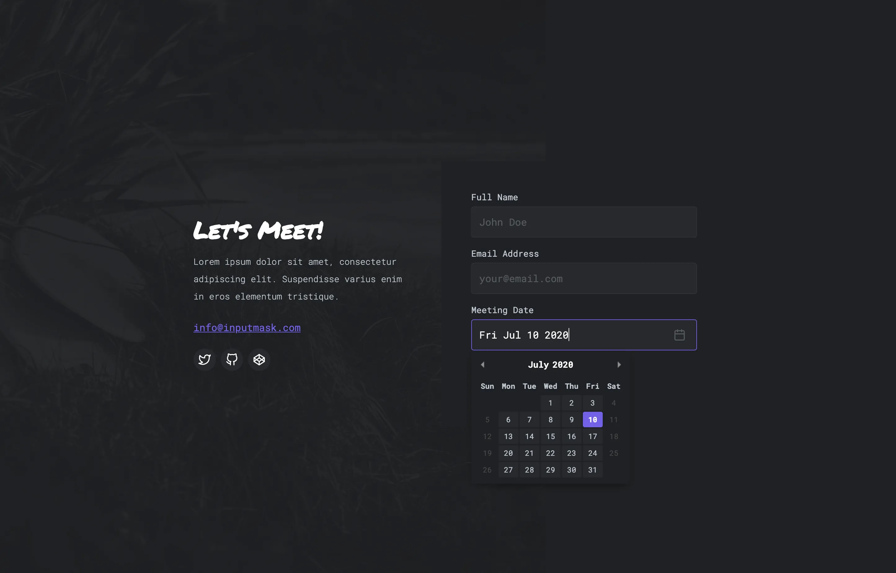
Add a custom date picker to your form for consistent date input. No more manually typing it in for your visitors. Customize the look to match your design.
Extra Info:
No extra info.
Clone Project
Documentation
Author:
David Bushell & Ramiro Rikkert
Status:
Deprecated
New
Updated
This crumb is no longer being supported.
Latest Version:
More related crumbs..
Want to contribute to the community?
Tell us what code you're working with. We would love to see it and possibly add it to the library.


