
Code Snippets for
Your Webflow!


This simple yet awesome jquery plugin will allow us to copy a coupon code (or any content you want) to our clipboard to use later somewhere else.
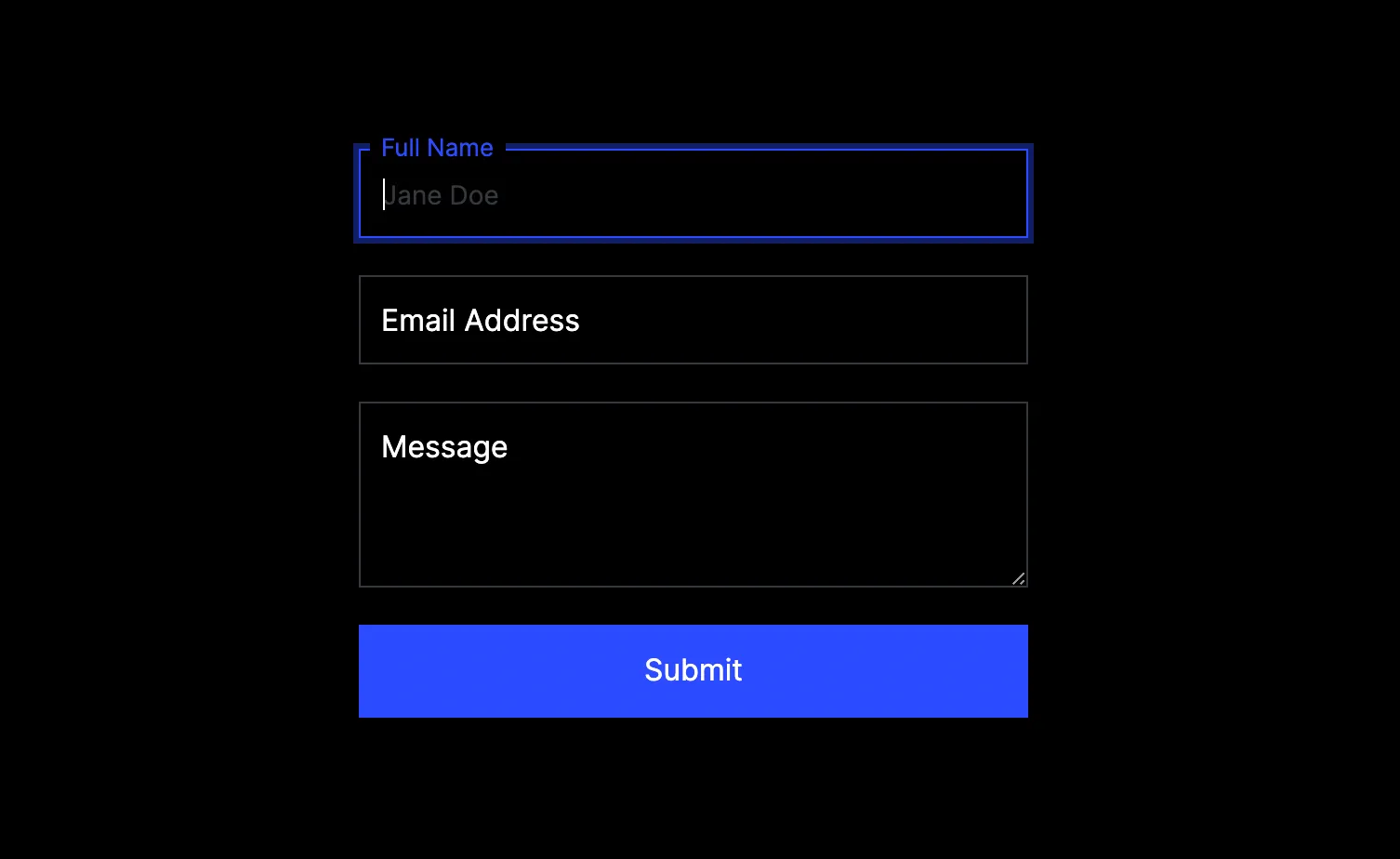
With this crumb we can simply create what is commonly known as floating form labels. A UI effect that allows you to display form labels as placeholders initially and animate them to typical labels.
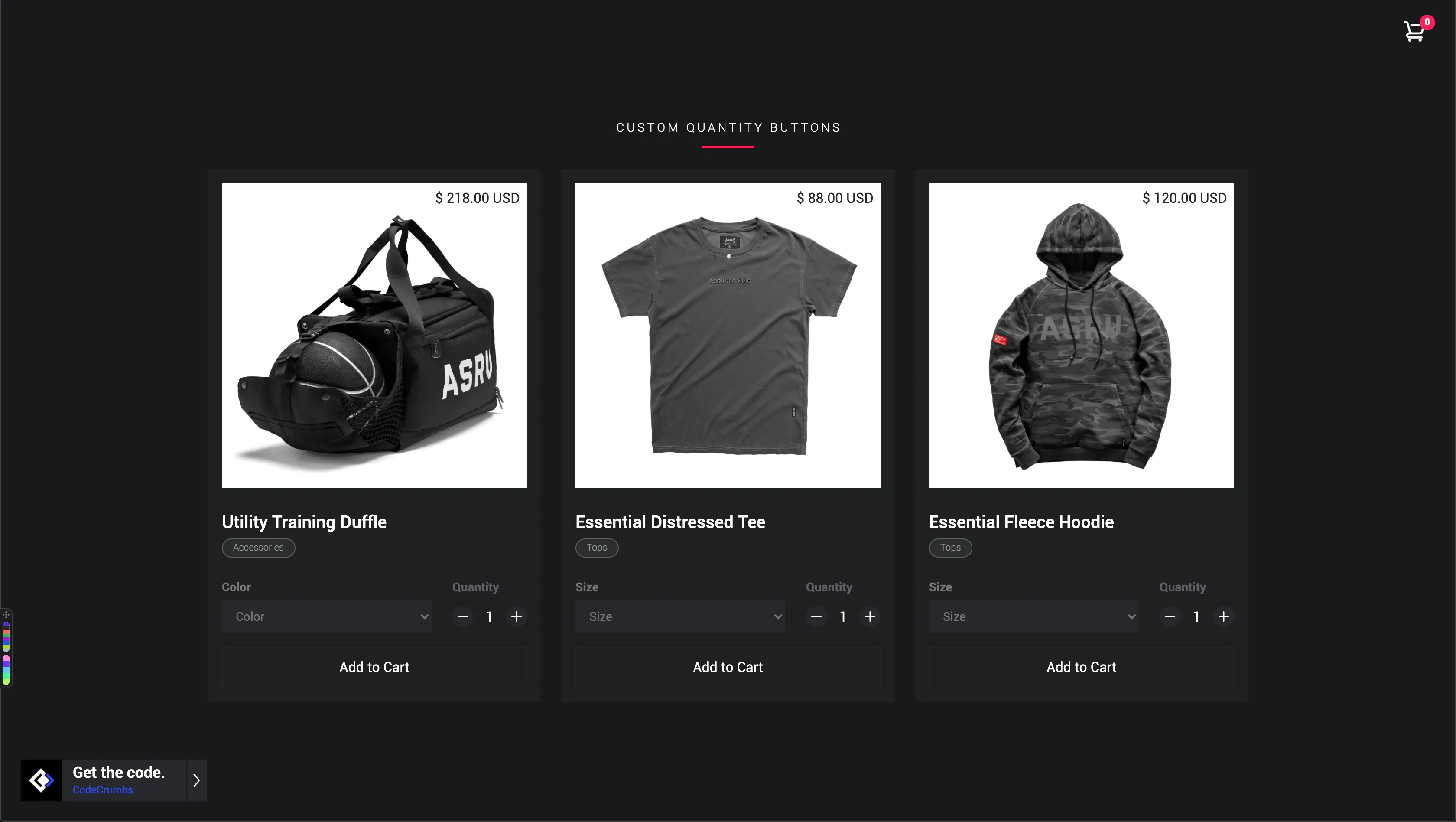
Now you can add really nice custom buttons for your products quantity field. This is great so users don't have to type the amount anymore.
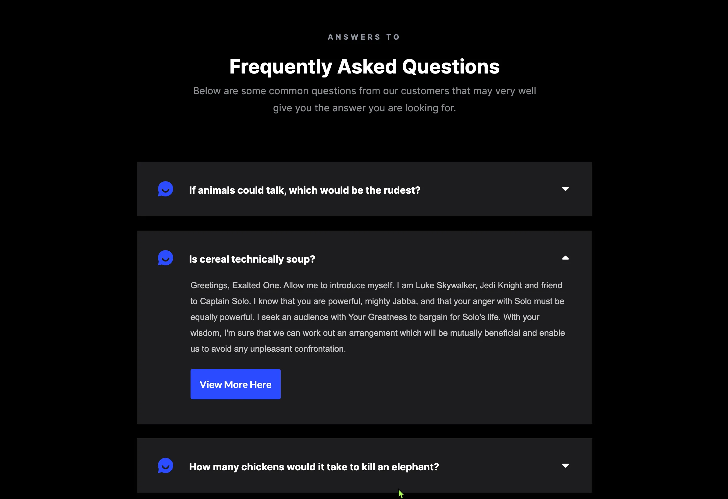
Smooth accordion that automatically closes an accordion item when a new one is selected. All elements are handled directly in Webflow.
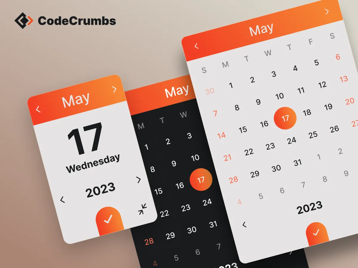
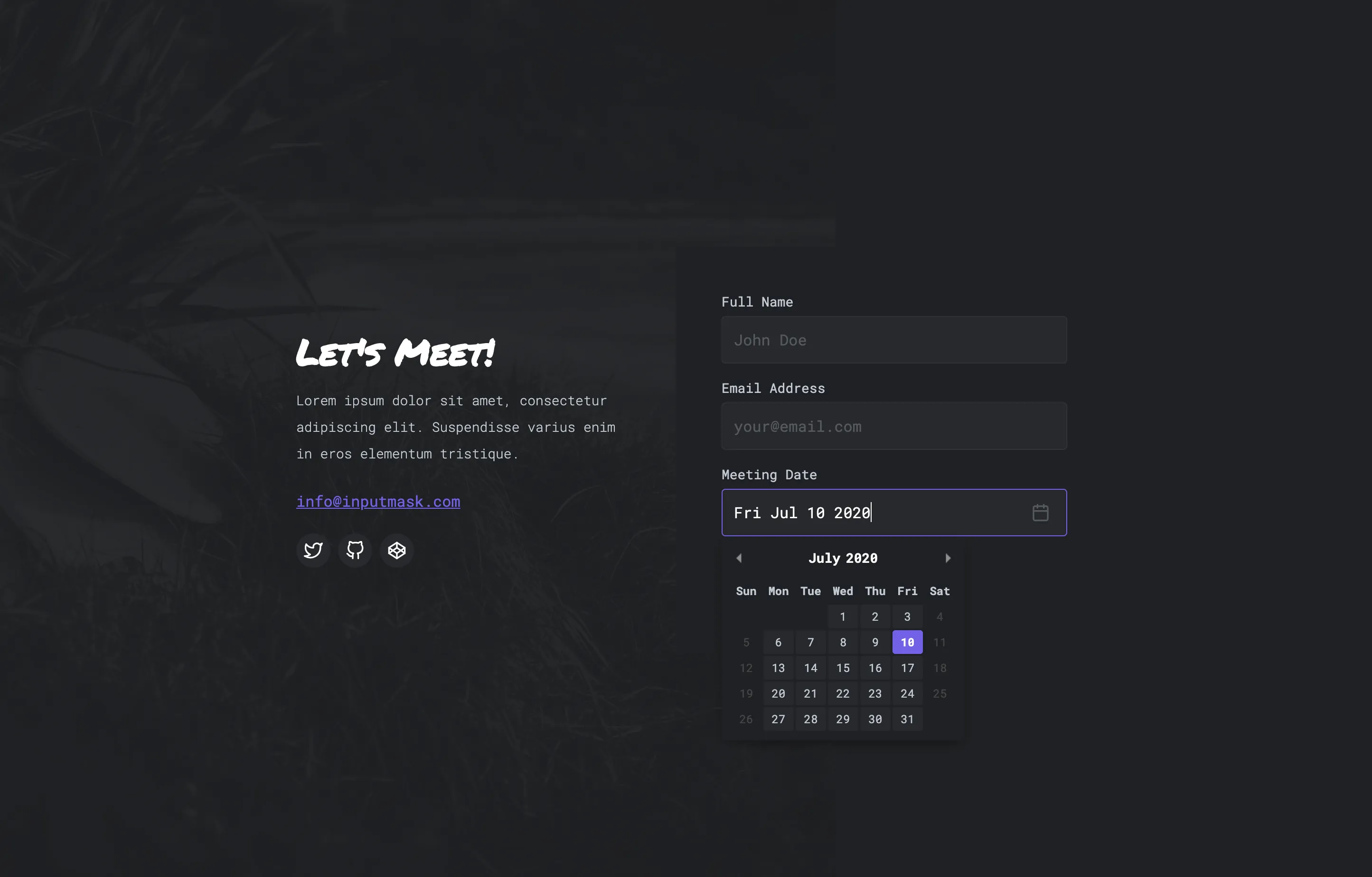
Date Picker
A beautiful themeable date picker / calendar with plenty of useful options. Supports several languages, date ranges and much more.
</ head> Code
</ body> Code
How to use:
Date Picker Options:
Language Documentation:
Below is a list of languages. Copy the script for language you wish to use and place it underneath the Date Picker script (above the Date Picker function). Next, copy the abbreviated "value" from the second column and use that as the value for the language option in the Date Picker function.
format Documentation:
Example: "WW the S" would display as "Monday the 5th." Play around with it!
disabledWeekDays Documentation:
disabledDays Documentation:
minDate and maxDate Documentation:
minYear and maxYear Documentation:
dateRange Documentation:
minRange and maxRange Documentation:
setDateForThisSelector Documentation:
Event Callback Documentation:
styles Documentation:
Scroll To Top
Lorem ipsum dolor sit amet, consectetur adipiscing elit. Suspendisse varius enim in eros elementum tristique. Duis cursus, mi quis viverra ornare, eros dolor interdum nulla, ut commodo diam libero vitae erat. Aenean faucibus nibh et justo cursus id rutrum lorem imperdiet. Nunc ut sem vitae risus tristique posuere.
<!--Delay Page Transition-->
<script>
$('classOrIdNameHere').click(function (e){
e.preventDefault(); var goTo = this.getAttribute("href");
setTimeout(function() {
window.location = goTo;
}, 1000);
});
</script>
How to use:
The rich text element allows you to create and format headings, paragraphs, blockquotes, images, and video all in one place instead of having to add and format them individually. Just double-click and easily create content.
Static and dynamic content editing
A rich text element can be used with static or dynamic content. For static content, just drop it into any page and begin editing. For dynamic content, add a rich text field to any collection and then connect a rich text element to that field in the settings panel. Voila!
Things to keep in mind:
- This is a numbered list item.
- This is a numbered list item.
- This is a numbered list item.
- This is a numbered list item.
How to customize formatting for each rich text
Headings, paragraphs, blockquotes, figures, images, and figure captions can all be styled after a class is added to the rich text element using the "When inside of" nested selector system.
<!--Delay Page Transition-->
<script>
$('classOrIdNameHere').click(function (e){
e.preventDefault(); var goTo = this.getAttribute("href");
setTimeout(function() {
window.location = goTo;
}, 1000);
});
</script>
<!--Delay Page Transition-->
<script>
$('classOrIdNameHere').click(function (e){
e.preventDefault(); var goTo = this.getAttribute("href");
setTimeout(function() {
window.location = goTo;
}, 1000);
});
</script>
<!--Delay Page Transition-->
<script>
$('classOrIdNameHere').click(function (e){
e.preventDefault(); var goTo = this.getAttribute("href");
setTimeout(function() {
window.location = goTo;
}, 1000);
});
</script>
<!--Delay Page Transition-->
<script>
$('classOrIdNameHere').click(function (e){
e.preventDefault(); var goTo = this.getAttribute("href");
setTimeout(function() {
window.location = goTo;
}, 1000);
});
</script>
<!--Delay Page Transition-->
<script>
$('classOrIdNameHere').click(function (e){
e.preventDefault(); var goTo = this.getAttribute("href");
setTimeout(function() {
window.location = goTo;
}, 1000);
});
</script>
Written Code for your Projects!
Pre-written snippets of code for you to quickly copy & paste into your projects. Tutorials for each snippet are also available to make things easier and understandable.


Awesome Contributors
CodeCrumbs would not exist without these awesome contributions from some amazing people. They too believe in helping others achieve more with their designs and projects in Webflow.
Helpful Resources


Diamond Tee
Now you can rep & show your support for the CodeCrumbs family & team with our new merch.
Want to contribute to the community?

